Let’s talk about the beige elephant in the room. For years, we’ve been told that safe, neutral colors are the key to a “timeless” home. We paint our walls greige, our furniture grey, and our accents—wait for it—more grey. We’ve equated sophistication with a complete lack of personality, and we wonder why our homes feel more like upscale hotel rooms than sanctuaries.
Here’s the truth they don’t want you to know: Color is courage. It’s emotion made visible. That feeling you get walking into a sunshine-yellow kitchen, the deep calm of a navy-blue library, the energizing pop of a terracotta wall—that’s not an accident. That’s psychology. That’s design with a pulse.
We’ve been sold a lie that bold color is risky, that it’s hard to sell a house with a red dining room, that it will “date” your space. But what dates a home faster? A soul-sucking sea of builder-grade beige, or a space that radiates confidence and joy?
This is your permission slip to break up with boring. Let’s move beyond accent pillows and dive headfirst into the paint can. Let’s learn how to use color not as a timid accessory, but as the architecture of feeling in your home.
Part 1: The Color Psychology Deep Dive (It’s Not What You Think)
Yes, blue is calming and red is energizing. But that’s kindergarten stuff. Let’s get nuanced. Color psychology is deeply personal and cultural, but some powerful, universal principles can guide you.
The Undertone is Everything (The Secret Language of Color)
This is the master key. Every color has an undertone—a hidden hue that makes it lean warm or cool.
- That “perfect” grey isn’t neutral. Is it a cool grey (with blue/purple undertones, feels crisp and modern) or a warm grey (with green/brown undertones, feels cozy and earthy)? Pair a cool grey with warm wood, and the room will feel “off.” Your eye detects the clash.
- Cream vs. White: Is it a bright white (blue undertone, feels clean and stark) or a creamy white (yellow/red undertone, feels soft and inviting)? The wrong one can make your space feel sterile or dirty.
The Rule: Always, always test a large swatch on your wall. See it in morning, noon, and night light. The undertone will reveal itself.
Saturation & Value: The Mood Dials
- Saturation: How pure and intense the hue is. A highly saturated emerald green is vibrant and dramatic. A desaturated sage green is soft and calming.
- Value: How light or dark the color is. A high-value (light) color feels airy and spacious. A low-value (dark) color feels intimate, cozy, and grounded.
Mixing them creates magic: A room in all low-value, high-saturation colors (deep jewel tones) is dramatic and cocooning. A room in high-value, low-saturation colors (pastels) is ethereal and serene.
Part 2: The Fearless Formulas (How to Actually Use Bold Color)
Okay, you’re ready. But how? Follow these designer-approved formulas to avoid chaos.
Formula 1: The 60-30-10 Rule (The Classic, Upgraded)
- 60% – Dominant Color: This is your anchor. Traditionally a neutral, but it doesn’t have to be. Your 60% could be a rich, deep wall color (like olive green or navy).
- 30% – Secondary Color: This provides contrast and support. If your walls are dark, this could be your upholstery in a lighter, complementary shade.
- 10% – Accent Color: This is your punctuation mark! The vibrant pop. The trick? Your accent color should appear at least three times in the room (a pillow, a book spine, a vase, a piece of art) to feel intentional, not random.
Formula 2: The Monochromatic Masterpiece
Not “one color” boring, but “one hue” brilliant. Pick one color family and explore every shade, tone, and tint within it.
- Example – Blue Room: Walls in a mid-tone slate blue, sofa in a deeper navy, rug in a pale powder blue, curtains in a blue-grey. Add texture (velvet, linen, wood) to keep it dynamic. This is incredibly sophisticated and calming.
Formula 3: The Complementary Punch
Use colors opposite each other on the color wheel for maximum vibrancy. The key is balance and value.
- Don’t do: Equal parts fire-engine red and forest green (it’s Christmas forever).
- Do: Deep emerald green walls (dominant 60%) with burnt orange velvet pillows and a rust-colored throw (accent 10%), on a neutral sofa (30%). One color leads; the other pops.
Formula 4: The “Color Drench”
This is for the truly brave. Paint everything in the room the same color: walls, trim, ceiling, even radiators and built-in shelves. It’s immersive, dramatic, and makes architectural details disappear, creating a stunning, cohesive jewel box effect. Perfect for powder rooms, studies, or dining rooms.
Part 3: Room-by-Room Color Prescriptions
Let’s get specific. What color should go where to get the feeling you want?
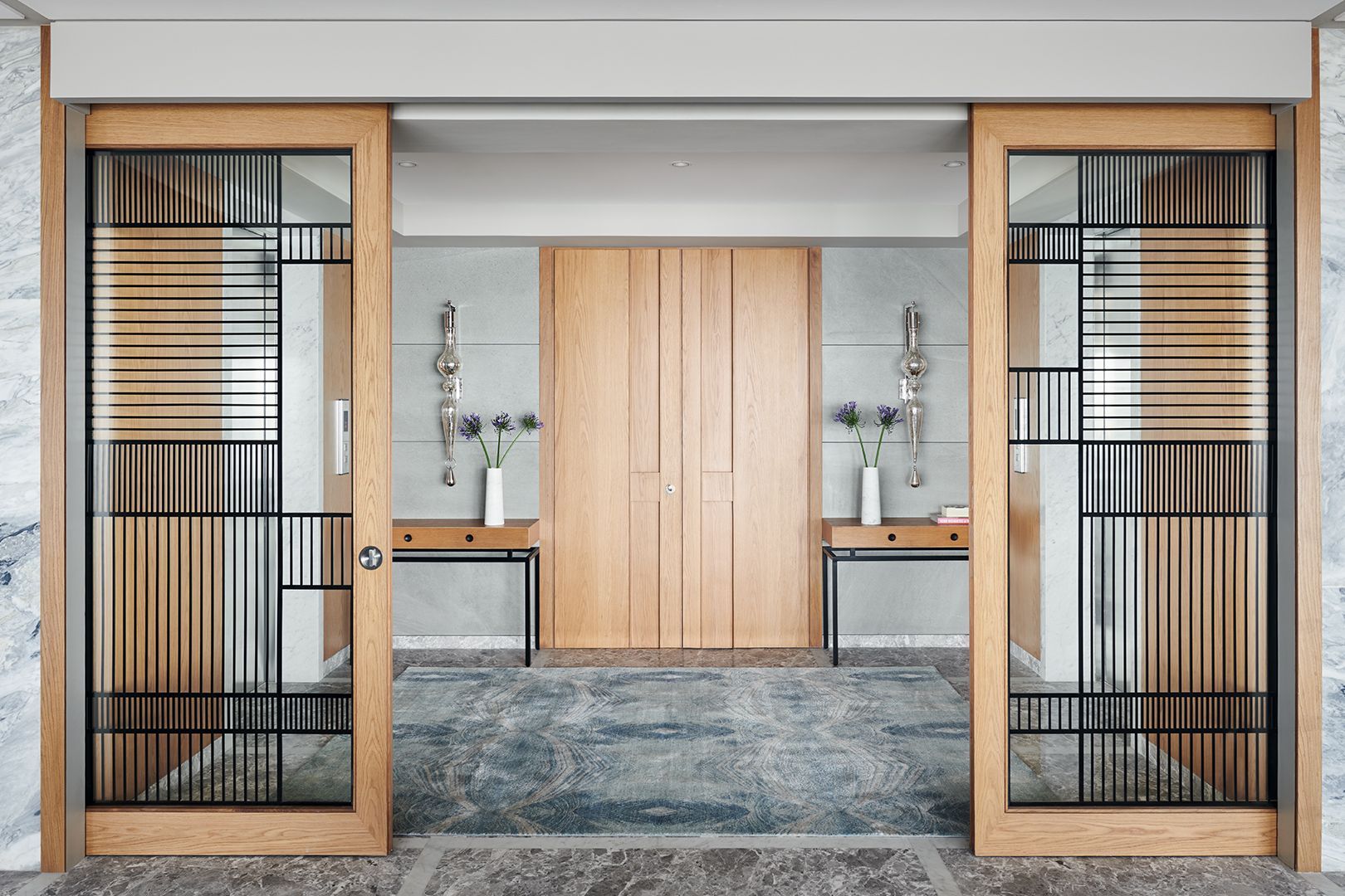
The Entryway: The First Impression
Goal: To welcome, intrigue, and set the tone for your home.
- Go Bold Here. This is a small, low-commitment space to make a huge statement. A high-gloss deep plum, a vibrant sunshine yellow, or a dramatic charcoal. It says, “This is not a boring house.”
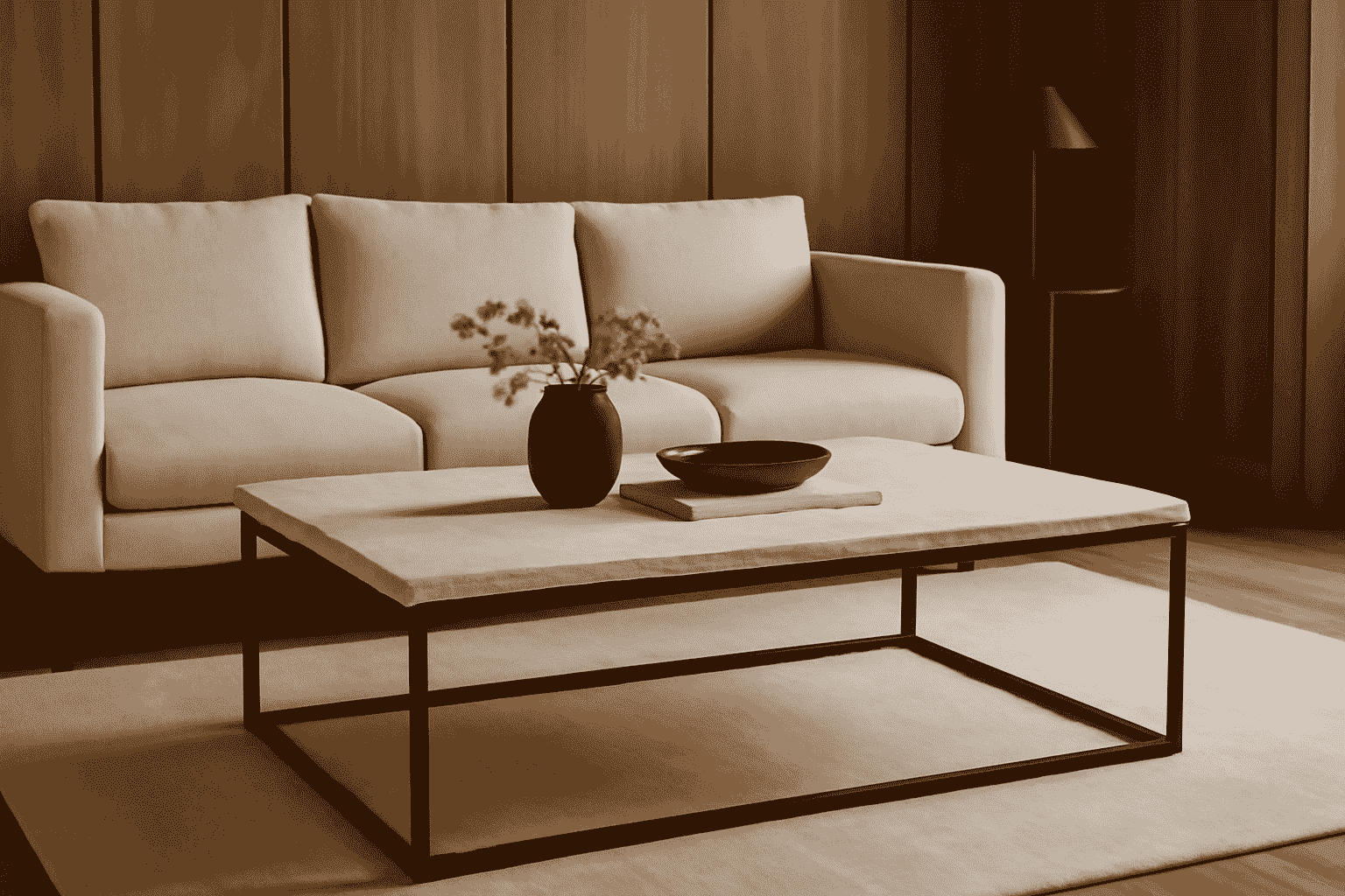
The Living Room: The Emotional Hub
Goal: To either energize for socializing or calm for relaxation.
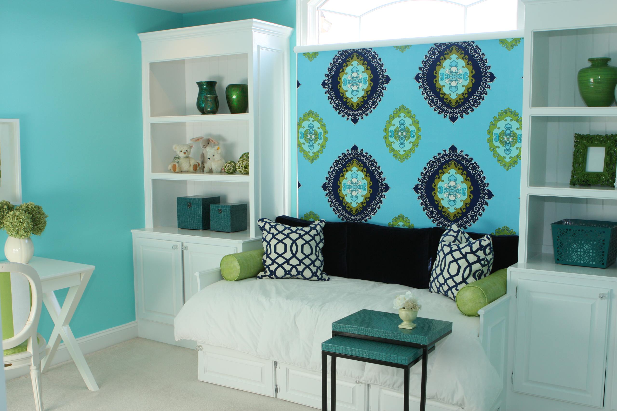
- For Energy & Conversation: Warm, saturated colors. Terracotta, mustard yellow, or a rich coral. They stimulate dialogue and feel inviting.
- For Calm & Relaxation: Cool, desaturated colors. Sage green, soft grey-blue, or lavender-grey. They lower the heart rate and encourage rest.
The Kitchen: The Heart of the Home
Goal: To stimulate appetite and foster connection.
- Warm Earth Tones Win: Olive green, navy blue (surprisingly!), warm burgundy, or creamy ochre. These colors feel nourishing and grounded. Avoid cool blues and greys—they can suppress appetite.
- Cabinet Confidence: Painting lower cabinets a dark, moody color (forest green, black) and uppers a light cream is a timeless, bold look.
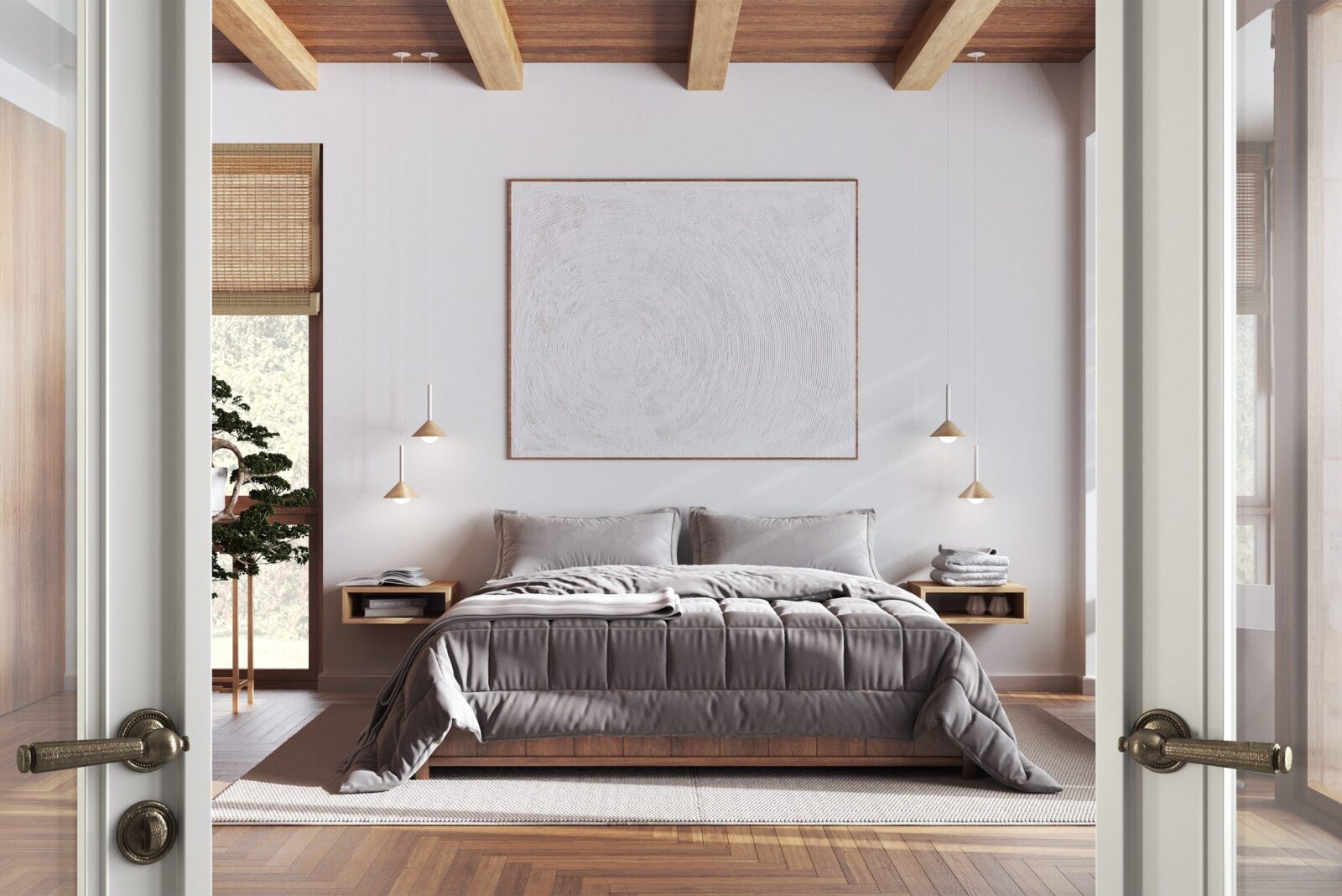
The Bedroom: The Sanctuary
Goal: To promote rest and intimacy.
- The Science-Backed Choice: Soft, muted blues are proven to lower blood pressure and aid sleep.
- The Cocoon Choice: Deep, matte shades of any color—charcoal, chocolate brown, midnight blue. They wrap the room in intimacy, making it feel like a protective cave.
- Avoid: Vibrant reds and oranges. They are stimulating, not sleep-inducing.
The Home Office: The Focus Factory
Goal: To encourage concentration and creativity.
- Green for Focus: Green is the color of balance and is easiest on the eyes. A muted sage or deep hunter green can aid prolonged concentration.
- Deep Blue for Intellect: Associated with clarity and thought. A navy blue accent wall behind your desk can feel stabilizing.
Part 4: The “How-To” Without the Fear
- Start with an Inspiration Anchor. Don’t start with a blank wall. Start with a piece of art, a rug, or a fabric you love. Pull your color palette from there.
- Test Like a Scientist. Buy sample pots and paint a 2’x2′ swatch on multiple walls. Live with it for 48 hours. See it in all lights.
- Consider the LRV. Light Reflectance Value (on the back of paint chips) tells you how much light a color reflects. Below 50 = dark and absorbing. Above 50 = light and reflective. Use this to manage how light or dark a room feels.
- Finish Matters. A color in a matte finish absorbs light, feels soft and sophisticated. The same color in a high-gloss finish reflects light, feels dynamic and bold. Use gloss on trim or doors for punch.
Conclusion: Your Home, Your Canvas
Your home is the one place in the world you have complete control over. It should be a reflection of your inner world, not a replica of a hotel lobby.
Color is the fastest, most affordable way to transform not just a room, but a mood. It requires no construction, just conviction. So, what are you waiting for? Pick up that paintbrush. Choose the color that speaks to your soul, not the one that’s “safe.”
Be bold. Be beautiful. Build a home that doesn’t just look like a picture, but feels like a feeling.
FAQs: Your Bold Color Questions
Q1: I love color, but I’m afraid I’ll get tired of it. What then?
A: This is the #1 fear, and it’s valid. The solution is strategic placement. Paint a room that you use for specific, finite times: a dining room (for evening meals), a study, a powder room. You’re less likely to tire of a bold color in a space you inhabit intermittently. And remember, it’s just paint. It’s the least permanent, most changeable element in your home. Repainting a room is a weekend project, not a life sentence.
Q2: I have a small, dark room. Can I still use dark colors?
A: YES. This is a myth that needs to die. Painting a small, dark room a light color won’t make it feel bigger or brighter; it will just feel like a small, dark room painted a sad, light color. Instead, lean in. Paint it a deep, rich, enveloping color (navy, charcoal, emerald). Add great lighting (layers of lamps), mirrors to reflect light, and keep furnishings minimal. The result will be an intentional, cozy, dramatic jewel box—infinitely more stylish than a poorly lit beige box.
Q3: How do I tie bold wall colors in with the rest of my home’s decor?
A: The thread that ties your home together shouldn’t be a wall color—it should be your “through line.” This can be:
- A consistent wood tone (all oak floors, walnut furniture).
- A consistent metal finish (all brass hardware and lighting).
- A repeating accent color that appears in every room (e.g., pops of burnt orange in art, pillows, or a rug).
- A consistent style of furnishings (all mid-century modern, all organic modern).
Let the walls be the variable that gives each room its unique personality, while your through line provides cohesive harmony.
Q4: What’s the biggest mistake people make with bold color?
A: Ignoring the ceiling. The ceiling is your fifth wall. Painting it the same white as every other house is a missed opportunity. If your walls are a bold color, consider painting the ceiling a lighter tint of the same color (e.g., walls = navy, ceiling = pale sky blue). This creates a seamless, immersive effect. Or, for drama, paint it the same color for a true “color drench.” The classic choice is a soft, creamy white—just ensure its undertone matches your wall color.
Q5: I live in a rental. How can I be bold without painting?
A: Your power is in temporary and movable color.
- Textiles: A massive, colorful rug. Floor-to-ceiling curtains in a bold pattern.
- Furniture: A brightly colored sofa, armchair, or bookshelf.
- Peel-and-Stick: High-quality, removable wallpaper on one focal wall.
- Art: Create a massive, bold gallery wall.
- Lighting: A sculptural lamp in a vibrant hue.
You can create an incredibly colorful, bold space without touching a wall. It’s all about the volume and intentionality of the colored pieces you bring in.